Simply to create a website for my design studio - Winyou Creative.
Design Core:
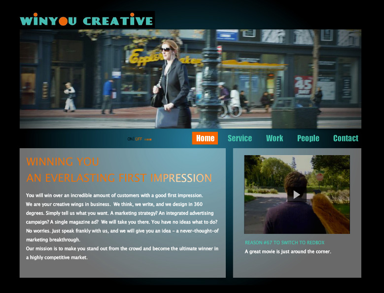
I opted for designing an original tone and feel by picking the right color combination and utilizing authentic imagery. I used the easy and convenient Wix platform but it had tons of restrictions. To do so, I especially took some street shots with my Nikon D80 on Market street in San Francisco.
Looking back at it, I really like the feel and color tone showing the momentum. But back then I thought it was too simple, and so I didn’t even save the whole website.
Highlights:
Logo
Color tone
Street photoshoot
Copywriting
2
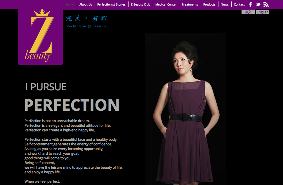
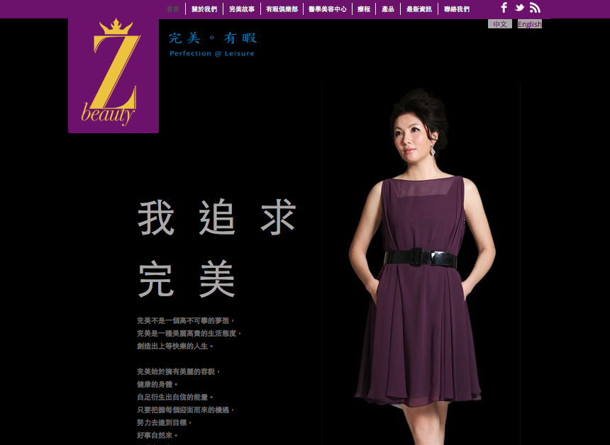
Z Beauty
Background:
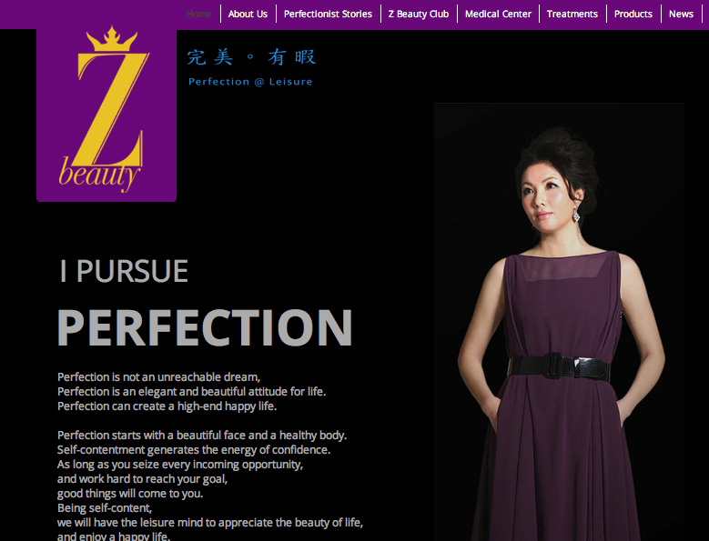
Z Beauty wanted to have a rebranding campaign after establishing from one salon to six centers. Most of their customers were middle-class upscale women: local Chinese and expats who spoke English.
Design Core:
It took a lot of work to craft every little detail of visual element to represent Z Beauty’s upscale brand image, although the website was built on Wix platform. To show off the beautiful image of Z Beauty business owner, Miss Z, I worked with a top-notch portrait photographer for a professional studio photoshoot.
Challenge:
I created the bilingual function by linking two domain names and adding two link buttons on each page after writing and translating the text, because Wix didn’t provide a bilingual function back then.
Highlights:
Bilingual
Slogan
Portrait photoshoot
Colors
English Version
Chinese Version
3
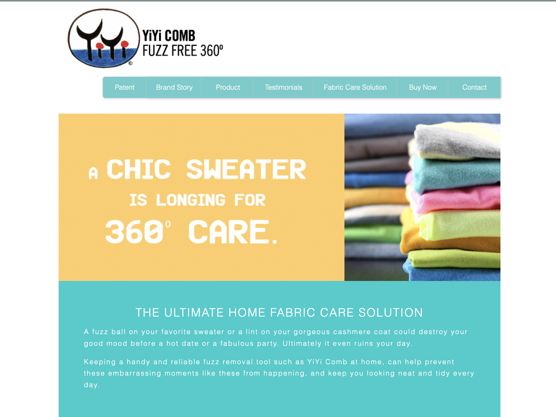
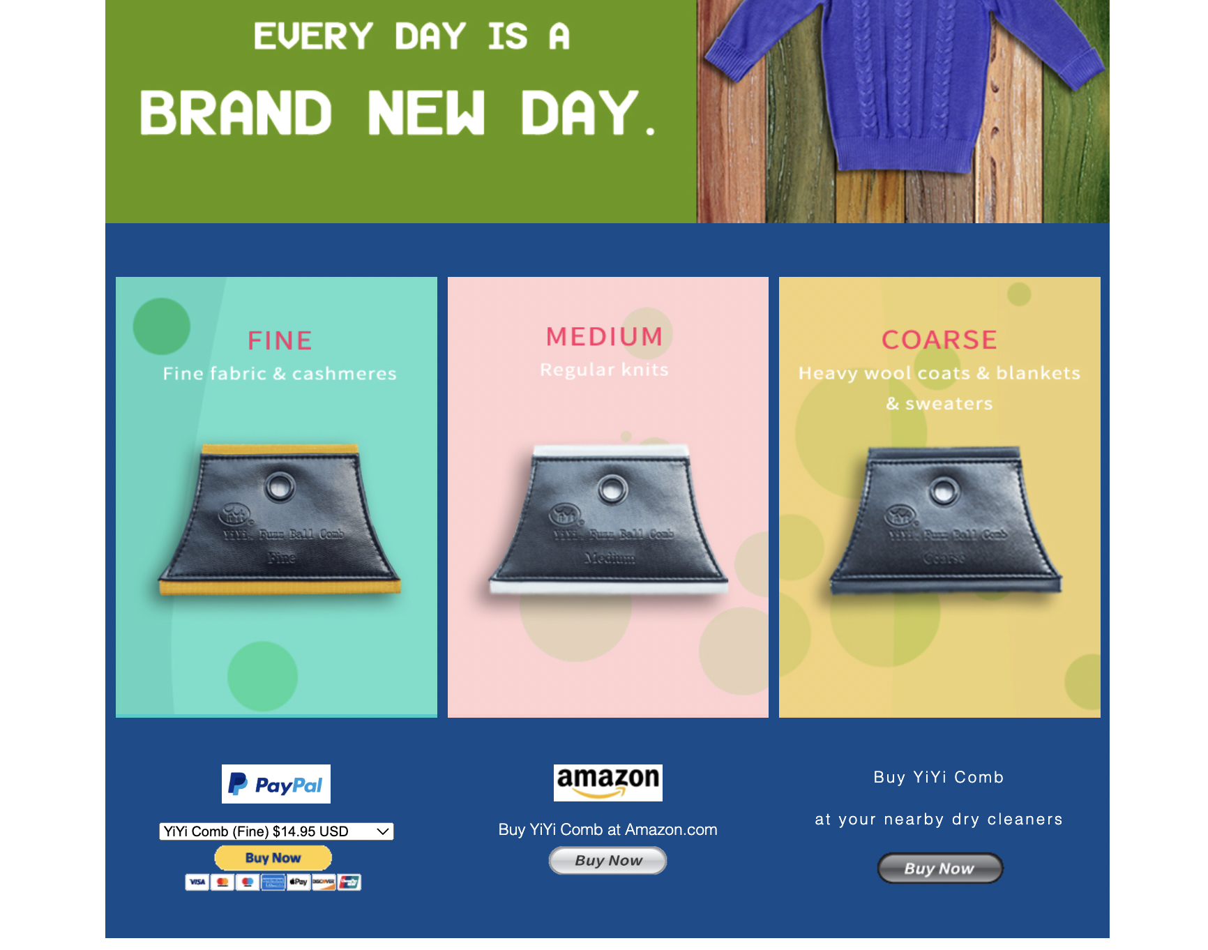
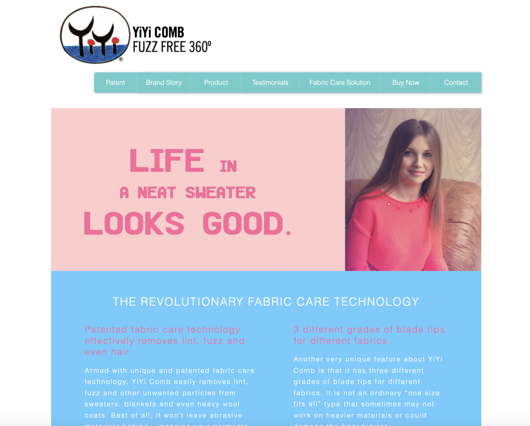
YiYi Comb
Background:
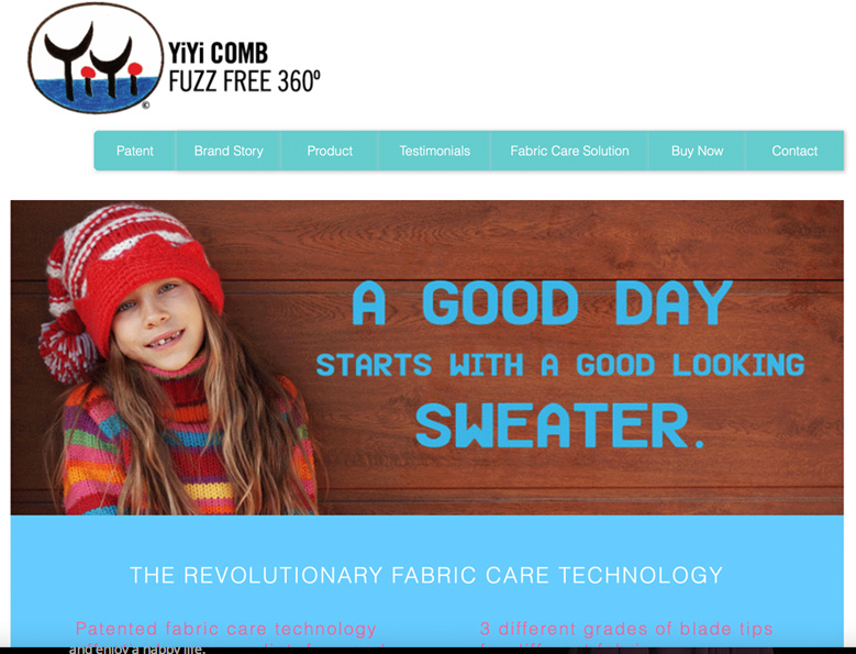
A small business owner wanted to systematically launch his patented fabric shaver product - YiYi Comb - after he successfully got some orders via Amazon.
Design Core:
I crafted the logo based on the client’s original drawing. Then, I wrote the tagline and catchy informative headlines. To make the website dynamic and attractive, I made an animated banner with Adobe Photoshop. The ultimate call to action was 3 “Buy Now” buttons: buy from the website immediately via PayPal payment; buy from Amazon; buy from nearby retailers. The client was very happy with the design and outcome.
For this website, I started to design with Adobe Dreamweaver and learn coding for more design flexibility.
Challenge:
The challenging part was to set up the online payment method. After I did a research and evaluated those online payment methods, I chose Paypal and Credit Card payment method, which was easier to handle by a small business owner.
Highlights:
Logo
Paypal and credit card online payment
Tagline and headlines
Gif animated web banner
4
Hit Creative
Background:
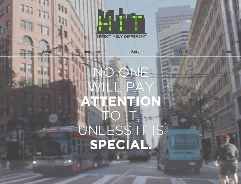
To launch my digital branding design company - Hit Creative.
Design Core:
I had the feel and image in mind: Hit Creative is a design company helping businesses create an effective and aesthetic brand image for business growth. Therefore, I used the images of different city buildings to symbolize business, and the blue sky to show the infinite growth. It needs action and movement to reach any business goal, so I made the words moving to achieve the motion effect. At first, I used Adobe Flash to design motion words in swf format, but then I found out that Adobe Photoshop’s gif format was better.
The logo came out almost effortlessly. Having the city buildings in my mind, I put the word “HIT” in a city silhouette and it just fit, and later I gave it a beat of green light. As for the authentic images, I shot some building pictures in Financial District in San Francisco with my Nikon D80.
For the video background on the 2nd version of the website, I took some videos on Market Street in San Francisco with my Canon 7D and chose the best clip to edit.
Highlights:
Logo
Video background
Cityscape background
Motion words
Street photoshoot
Street video shoot
5
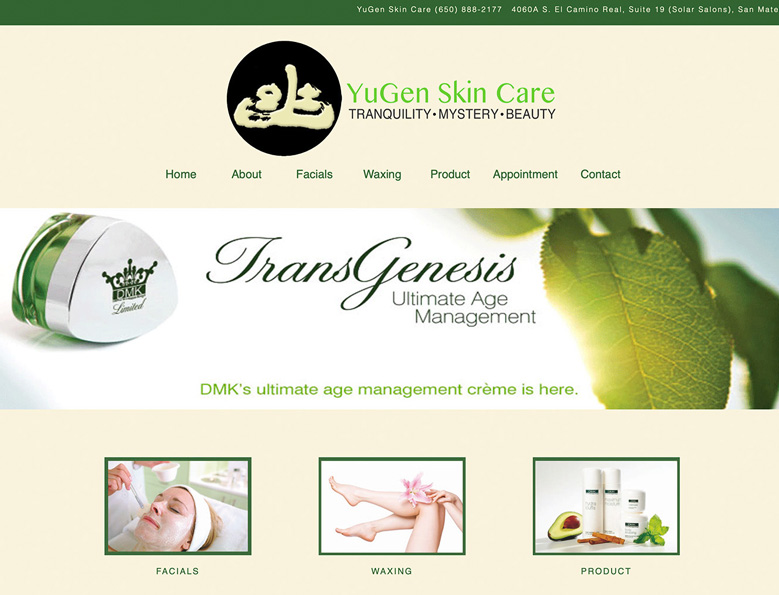
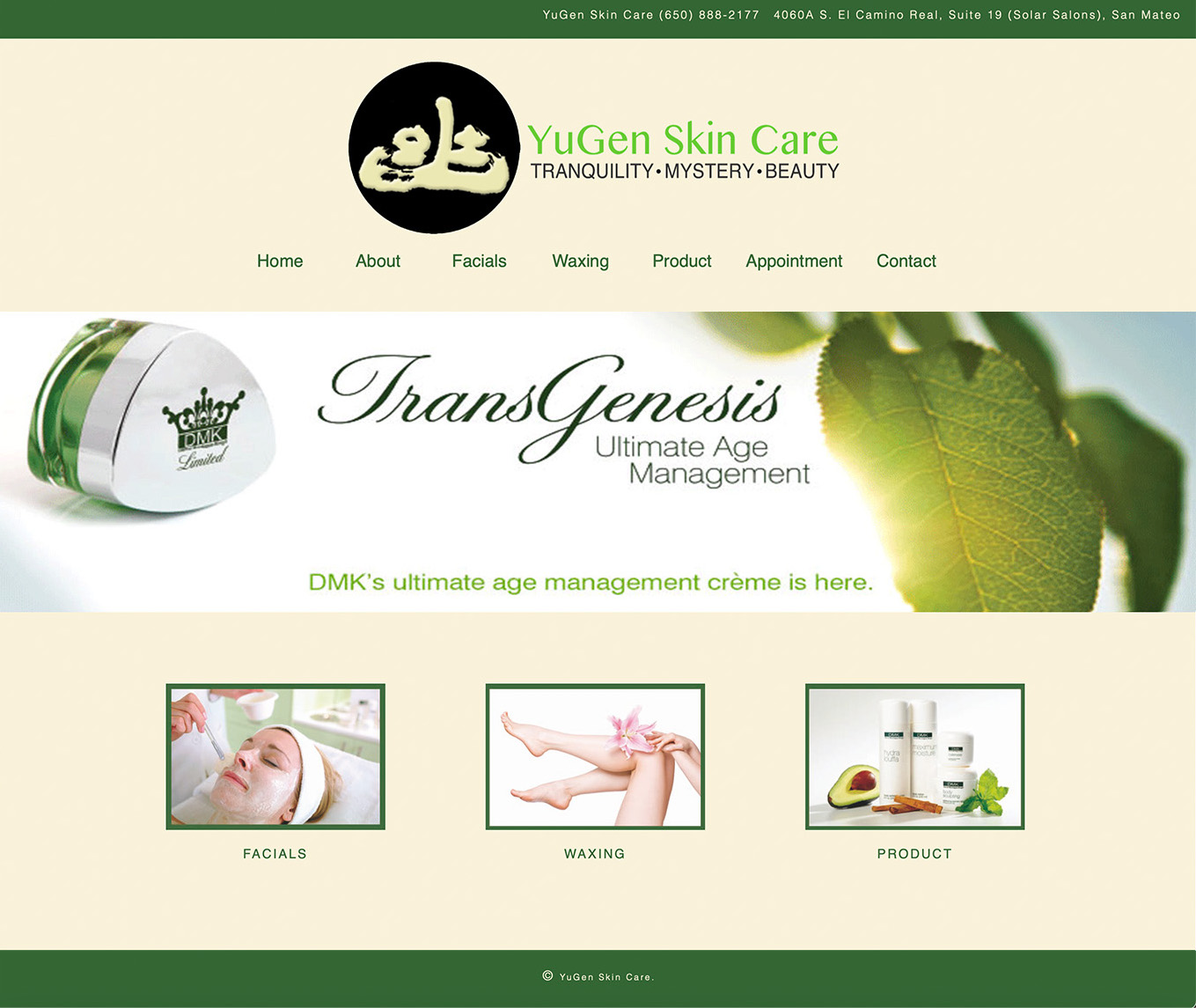
Yugen Skin Care
Background:
After several meetings and proposals, the client finally chose me over others to create a website for their new skin care salon business.
Design Core:
I did a research about skin care salons and suggested a zen feel which resonated with the business owner’s vision. They liked the logo, that I crafted based on the calligraphy they provided, as well as the color scheme, green and beige.
Challenge:
The client insisted on using their favorite calligraphy for the logo and wouldn’t change any word of the slogan. I did a few trials and crafted this zen feel logo based on the calligraphy, which they happily accepted.
Highlights:
Logo
Color scheme
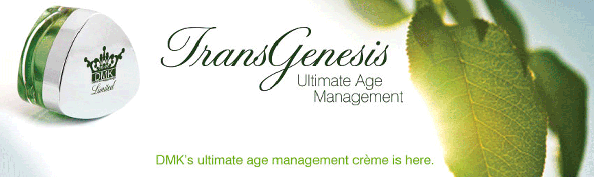
Animated web banner
6
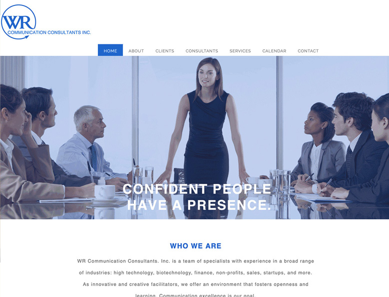
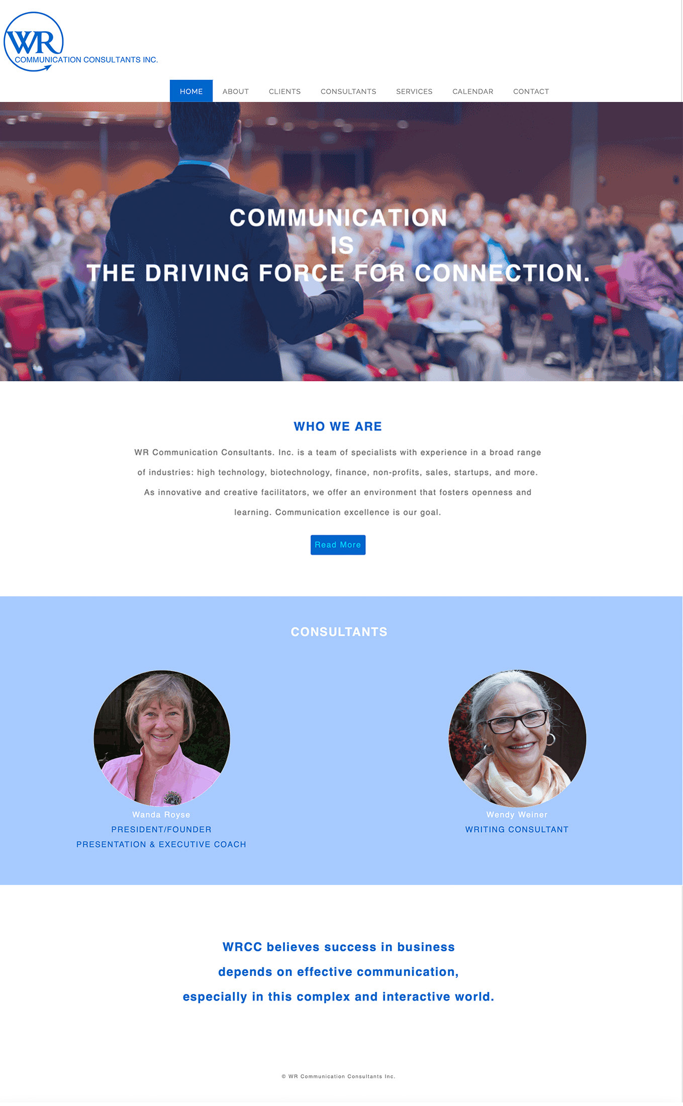
WR Communications
Background:
The client had an old and stale website. They wanted to rebrand it with a modern look to appeal to their younger audience.
Design Core:
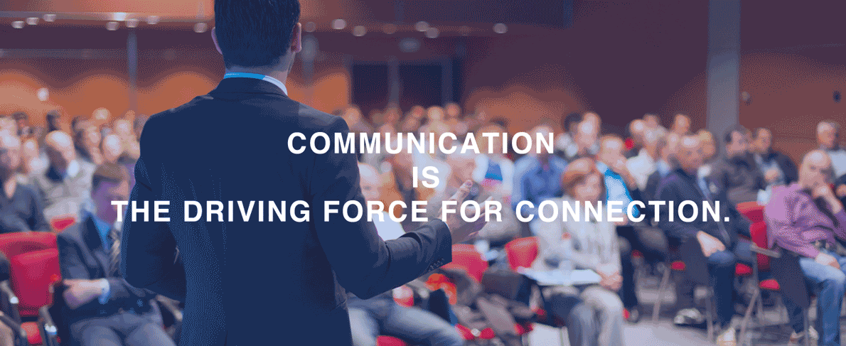
It was a fully responsive website. At first I set the blue color tone, which was good for their professional image of communication expert and to have a little tech feel, because many of their customers were young tech engineers and founders. Then I created the new logo with an open circle to signal communication and networking, and with an arrow at the end to look dynamic and forward thinking. Moreover, I chose the colorful images with their target audience on so that it gained the outcome of "Show, Don't Tell". The client said it was effective.
Challenge:
The client provided a very long copy. Other than reorganizing and editing their copy, I wrote some catchy headlines based on their copy to convey their main messages right away. Also, designing some graphic images in between the long copy made the website more readable. The client was very happy with this solution.
Highlights:
Responsive coding
Logo
Headlines
Animated menu bar
Graphic images
7
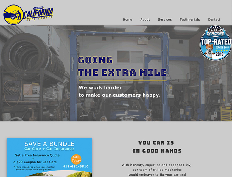
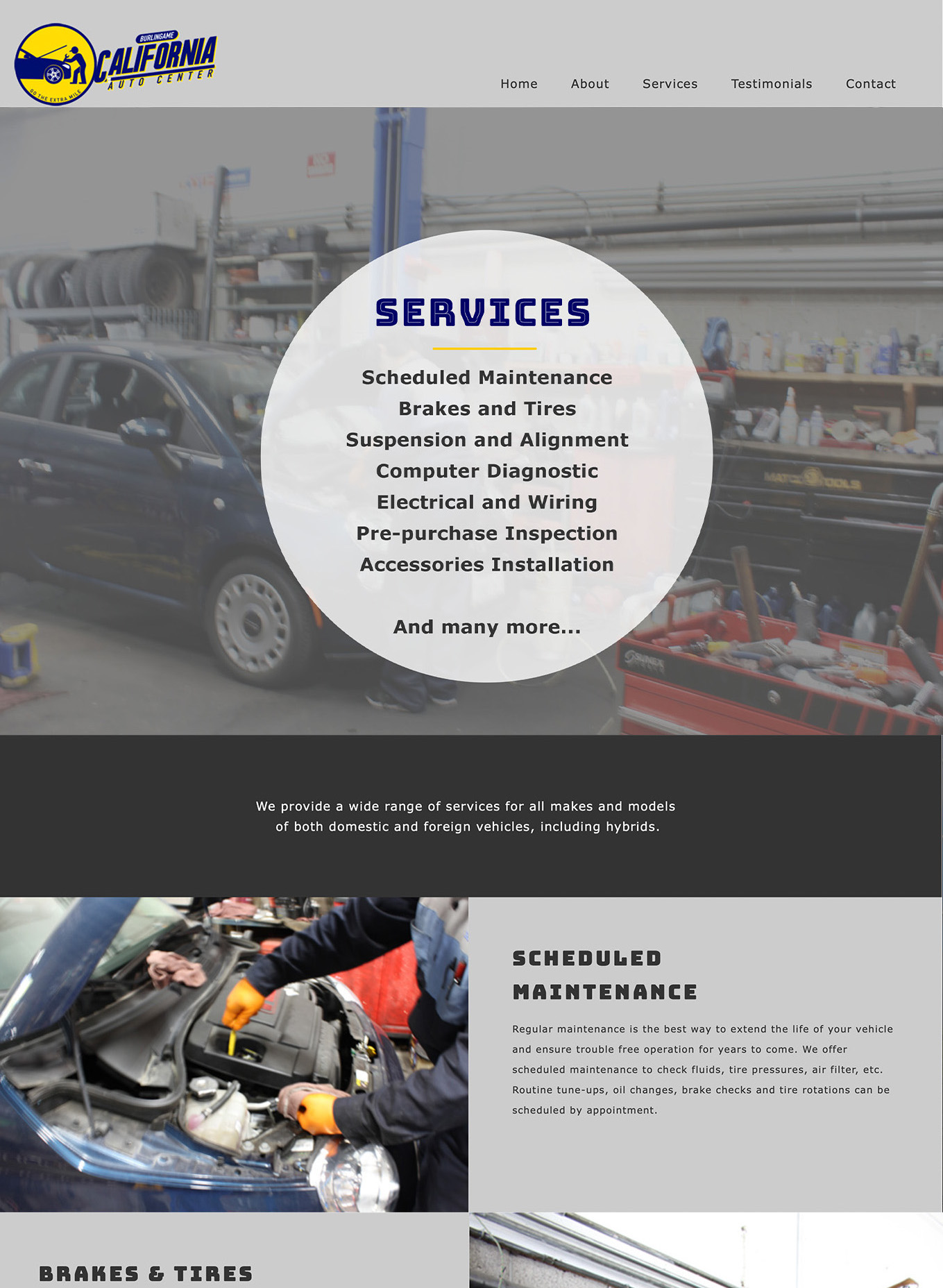
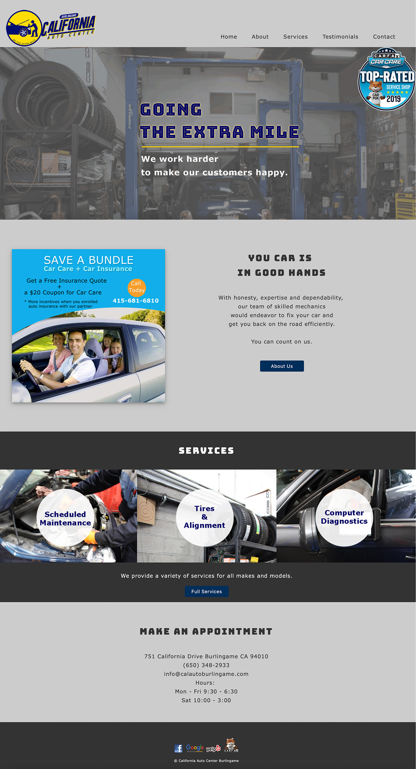
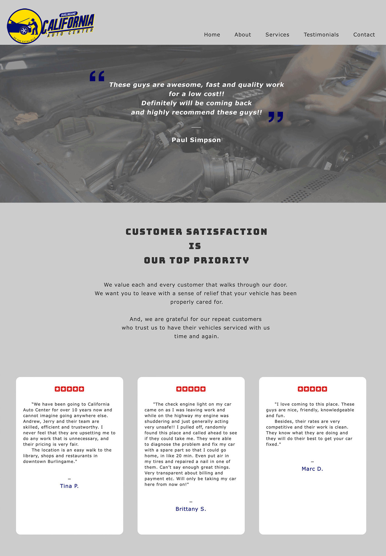
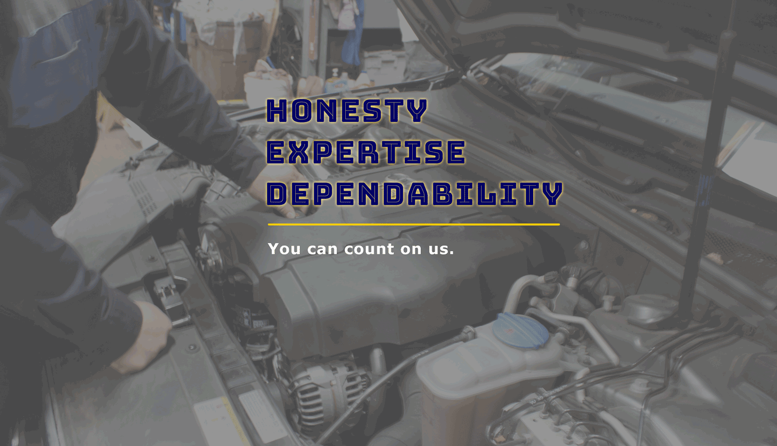
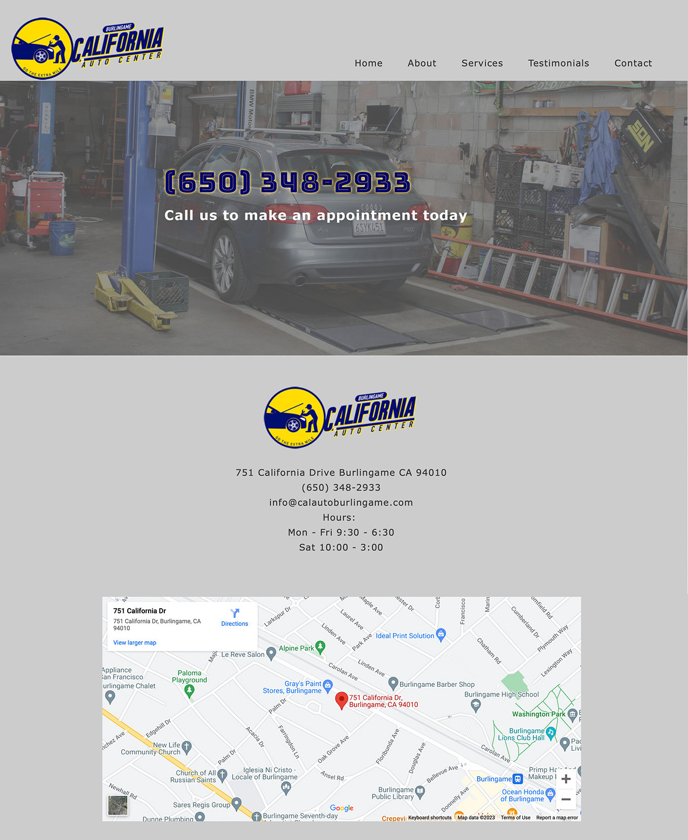
California Auto Center, Burlingame
Background:
A well-established car care shop wanted a website for business growth. One of their business partners from marketing appreciated good quality and good design and gave me plenty of creative freedom.
Design Core:
Everything was designed from scratch, starting from logo and copywriting. To give it a trustworthy feel, I opted to use real images instead of stock photos. I took some photos on site while they were working, and the photos turned out great. Furthermore, I tried two bold typefaces and they turned out great as well. The edgy typography suited the car care shop’s image perfectly.
Highlights:
Responsive coding
Logo and tagline
Edgy typography
Onsite photoshoot
8
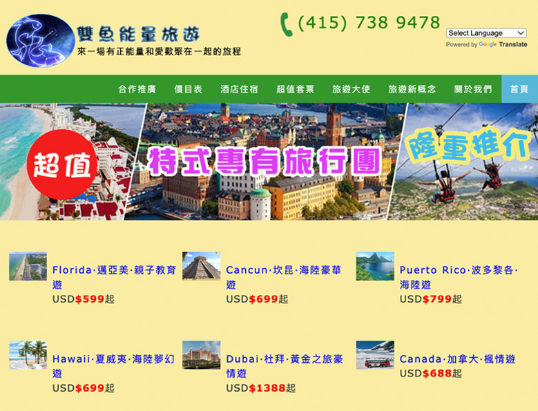
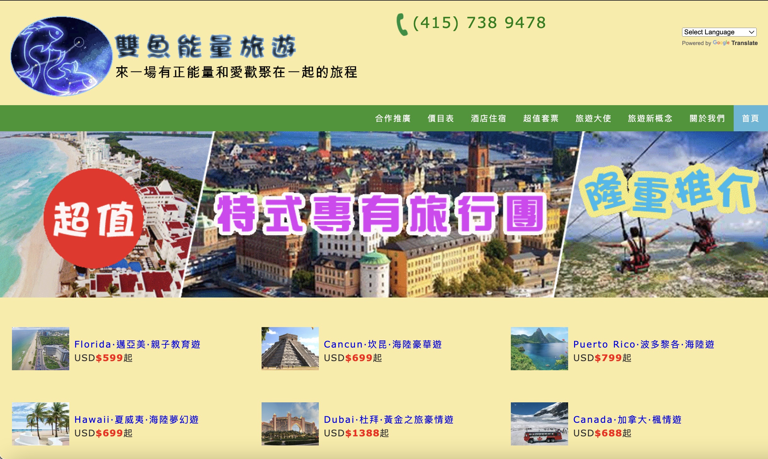
288 Tour
Background:
This travel agency client just wanted a functional website and didn’t care about any design and aesthetic things much and even resisted it. Their practice didn’t meet my design standard, but the Google Translation function was interesting. So I still undertook this web design project.
This travel agency was located in Chinatown in San Francisco and their customers were mostly Chinese, so they preferred a Chinese website to English, but they wanted to have a language translation function, especially English translation, for a few other customers.
Design Core:
I employed the easiest and most convenient Google Translation plugin. The client was happy with it. Within limits, I still designed a web banner with some animated words on scenery pictures to enhance the aesthetic of the website. And I created some unique web icons to make their services look better on the website. Eventually the client was very happy with what they got.
Highlights:
Google Translation
Animated web banner
Graphic icons
9
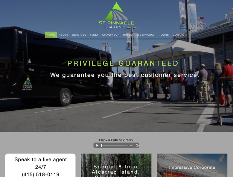
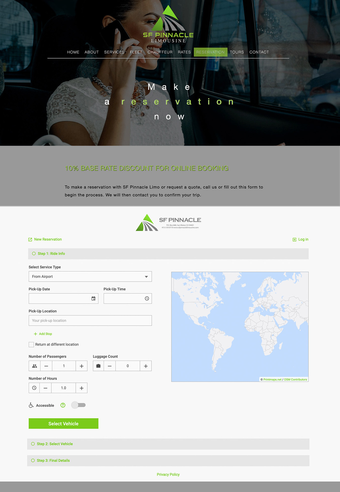
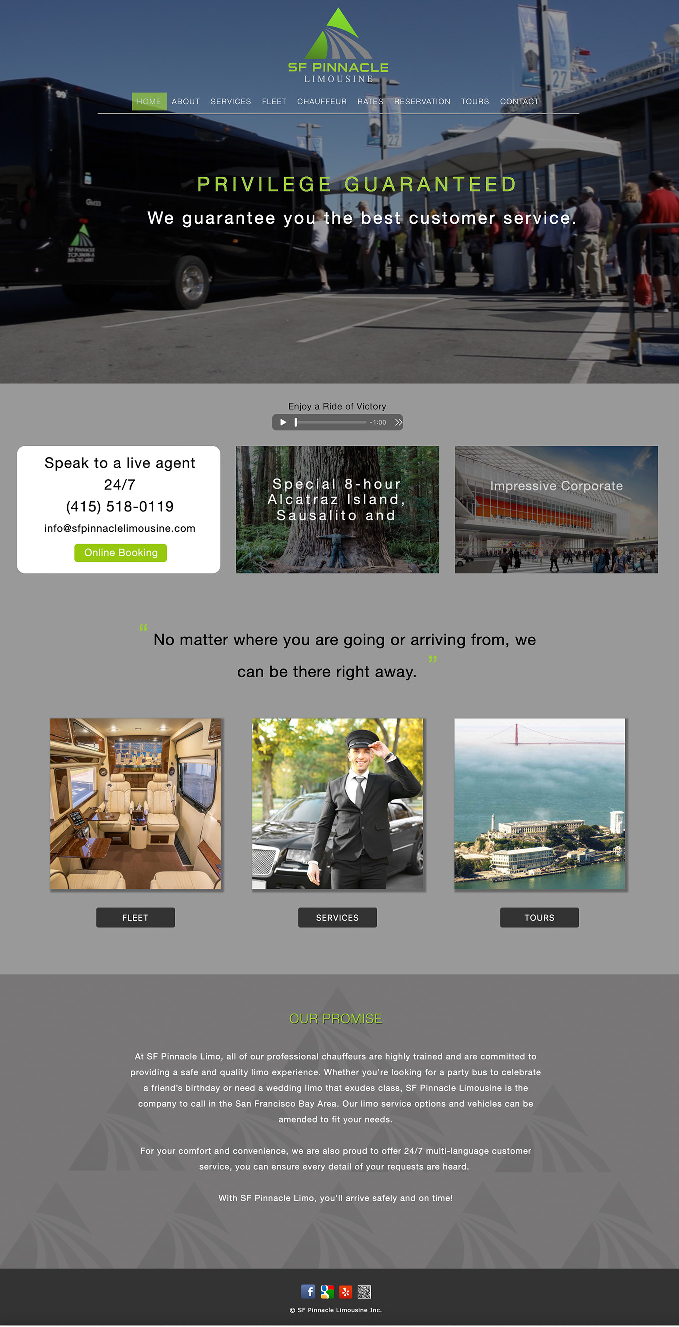
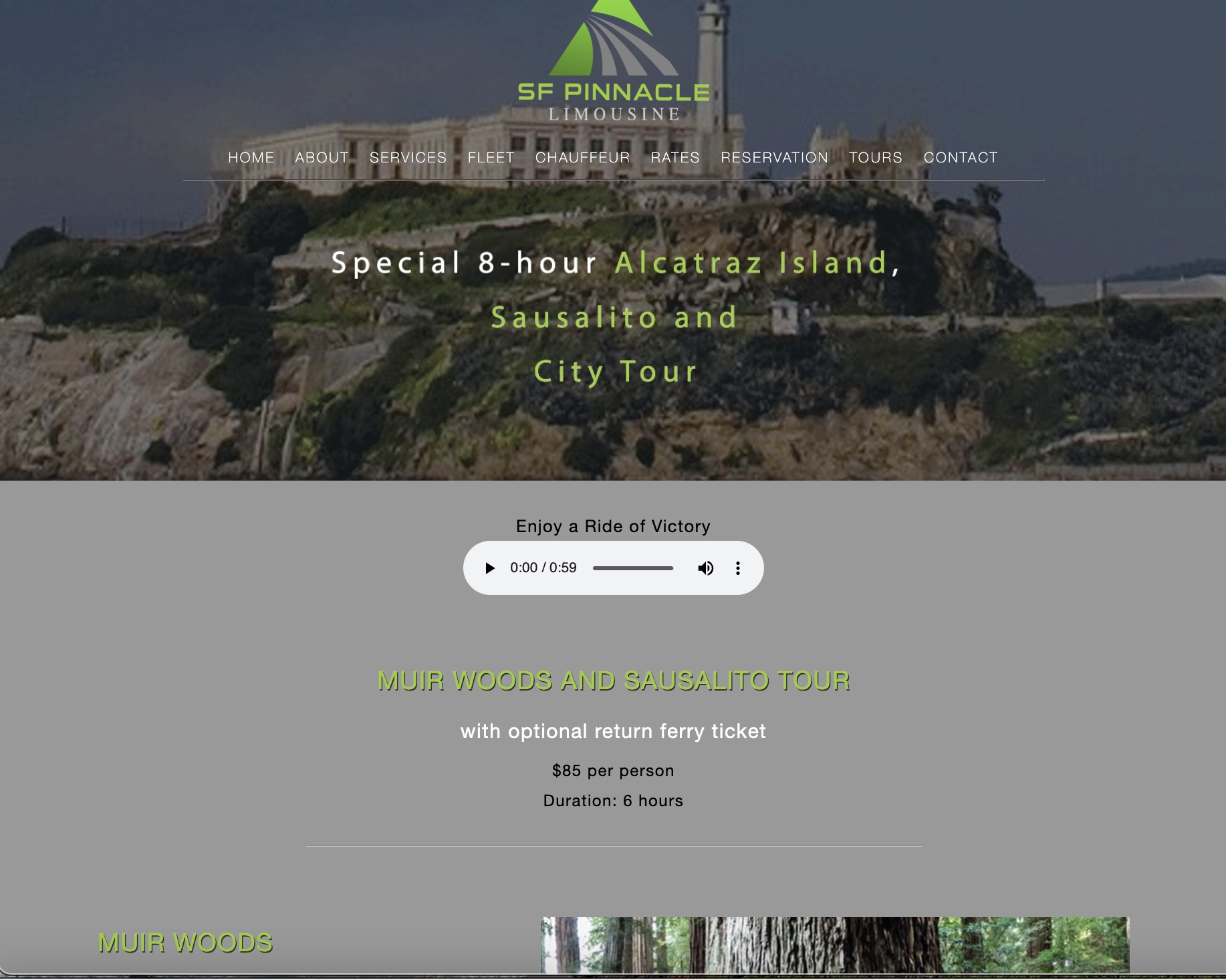
SF Pinnacle Limousine
Background:
SF Pinnacle was disappointed with the performance of their website on a drag and drop platform, so asked me to create a new website.
Design Core:
I fine-tuned the old logo to make it look sharper and professional. Limousine is a premium service, so I wrote the tagline - “Privilege Guaranteed” - to create a prestigious brand image. And I extracted the message in the provided copy to write some catchy headlines. As for their new services, like tours that they didn’t have old content, I had to do a research, learn it and write the copy, and even gave them some new tour ideas.
I could just use the still photos that they provided, but I suggested that a video would show SF Pinnacle’s moving forward momentum better. It wasn’t a difficult task, I followed one of their city tour to shoot a video with my Canon 7D, then edited the video with Adobe Premier. Finally, I tested a few formats and chose the mp4 format to ensure the fast website loading time.
Challenge:
The business owner desired to put his favorite song - "Victory" - on the website. The song was too long and too distracted. I selected and edited a short clip and added a play button so that it wouldn’t bother the website viewers. Also, I added a subject line - “Enjoy a ride of victory”. As a result, the song was turned into a nice addition to the website. The client was very happy with it.